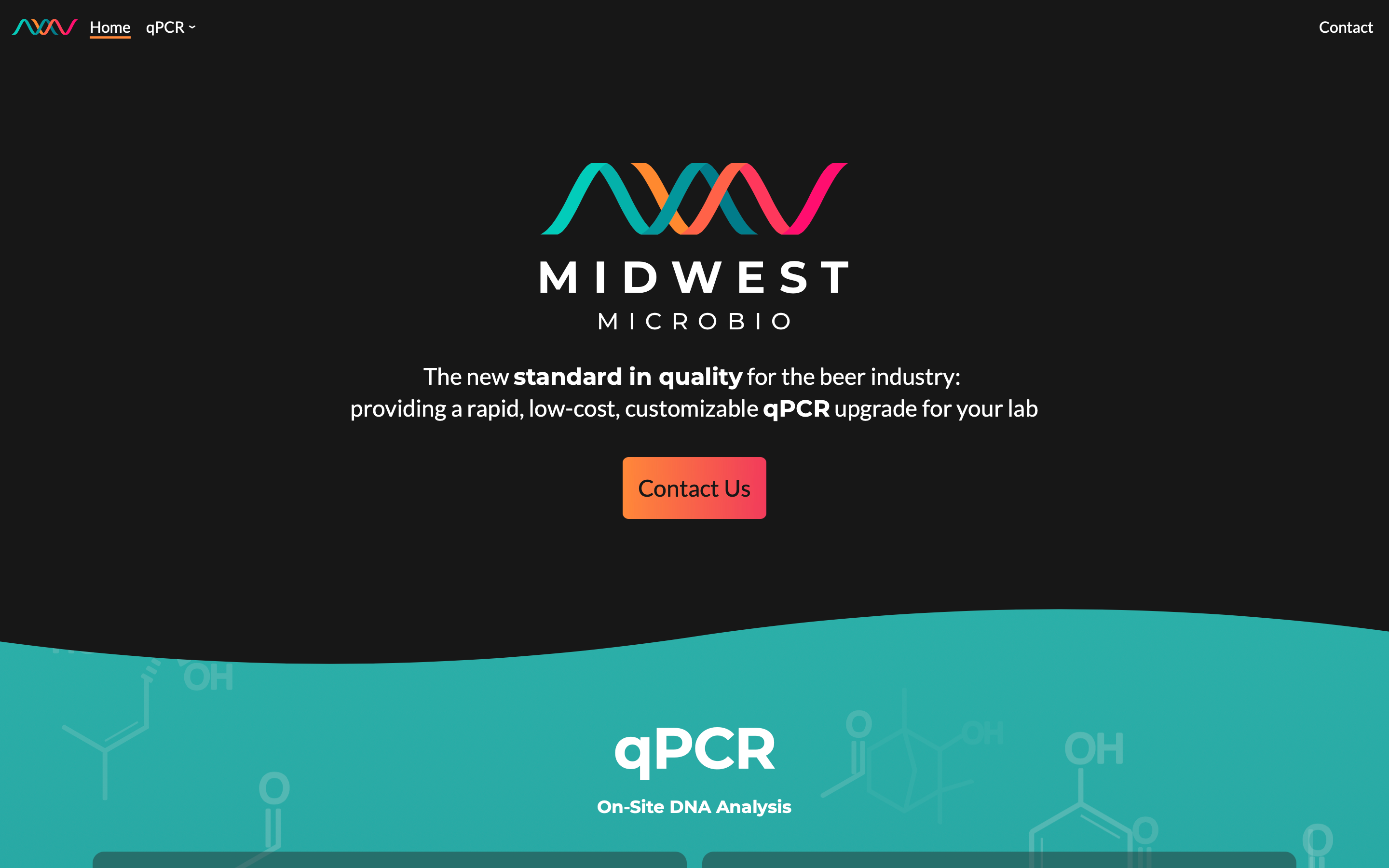
Midwest Microbio site
🗓️ 2019
My buddy realized that testing in the beer industry sorely needed an upgrade. So, he took his chemistry degree and set to it.
Of course, what's a good business without a good marketing website? And I was just starting out as a web developer, so I offered to help.
All I had to go on was the logo, which gave me some colors, some shapes, and a font. I used that to try and create a simple, clean, modern design. (Of course, I'm not really a designer, so "simple and clean" is about all I can manage.) Of course, around the same time, Netlify and others had this really cool wave aesthetic that I was really into and wanted to try out. So I did.

And, of course, if know you me, you know that I've never gotten over that amazing parallax effect on the Firewatch website, so I had to get some parallax in there, too.
Over time, the site grew. It started out as a basic 11ty site. Now, it's written in SvelteKit. It was also a great chance to learn Tailwind CSS, a tool I have come to understand and enjoy, even in production. The content comes from Prismic. It used to be hosted on Netlify, but now it's on Vercel.
And I've built some cool illustrations, too! For example, there's this totally extra qPCR visualization that I built with my favorite charting library, pancake
Or, this over-the-top assay visualization built with D3
Not sure going that hard was necessary, but it sure was fun!